ABInbev
Anheuser-Busch Inbev is the largest global brewer with nearly 25% global market share and one of the world’s top five consumer products companies. On 18 November 2008, the combination of InBev and Anheuser-Busch closed, creating Anheuser-Busch InBev. They produce popular brands of beer such as Stella Artois, Beck’s and Budweiser.
Citi
Citigroup Inc. is a major American financial services company based in New York. Citigroup was formed from one of the world’s largest mergers in history by combining the banking giant Citicorp and financial conglomerate Travelers Group on April 7, 1998. Citigroup has the world’s largest financial services network, spanning 140 countries with approximately 16,000 offices worldwide.
Wachovia
Wachovia provides a broad range of banking, asset management, wealth management, and corporate and investment banking products and services. It is one of the largest providers of financial services in the United States.
Wachovia Corporation was originally created by the merger of the legacy Wachovia Corporation and First Union Corporation. First Union was considered the acquirer in the transaction with Wachovia, although the transaction was structured as a tax-free union of equals and the combined entity chose to retain the Wachovia name.
Bank Of America
The Bank of America Corporation is the largest bank holding company in the United States, by assets, and the second largest bank by market capitalization. The purchase of BankAmerica by the NationsBank Corporation was the largest bank acquisition in history at that time. While the deal was technically a purchase of BankAmerica Corporation by NationsBank, the deal was structured as merger with NationsBank renamed to Bank Of America.
JPMorganChase
JPMorgan Chase is one of the oldest financial services firms in the world. It has operations in 60 countries. JP Morgan Chase is one of the Big Four banks of the United States with Bank of America, Citigroup and Wells Fargo. JPMorgan Chase, it its current structure, is the result of the combination of several large U.S. banking companies over the last decade including Chase Manhattan Bank, J.P. Morgan & Co., Bank One, Bear Stearns and Washington Mutual.
Verizon
Verizon is an American broadband and telecommunications company. Bell Atlantic acquired GTE on June 30, 2000 and changed its name to Verizon Communications Inc. It was among the largest mergers in United States business history.
ExxonMobil
ExxonMobil is an American oil and gas corporation. It is a direct descendant of John D. Rockefeller’s Standard Oil company, and was formed on November 30, 1999, by the merger of Exxon and Mobil. ExxonMobil is the world’s largest publicly traded company when measured by market capitalization.
Arcelor
Arcelor was the world’s largest steel producer in terms of turnover and the second largest in terms of steel output in 2004. The company was created by a merger of the former companies Usinor (France) and Arbed (Luxembourg) in 2002. Arcelor is now part of Arcelor Mittal.
Sprint
Sprint Nextel Corporations is a telecommunications company based in Overland Park, Kansas. The company was created in 2005 by the purchase of Nextel Communications by Sprint Corporation. Sprint owns and operates the third largest wireless telecommunications network in United States, with 48 million customers.
SquareEnix
SquareEnix is a video game and publishing company based in Japan. It is best known for its console role-playing game franchises, which include the Dragon Quest series, the Final Fantasy series, and the action-RPG Kingdom Hearts series. The company was formed as the result of a merger between Square Co. and the Enix Corporation.
GDFSuez
GDFSuez is a French-based energy company active in the fields of electricity generation and distribution, natural gas and renewable energy. The company was formed by the merger of Gaz de France and Suez on 22 July 2008.
Chevron
Chevron Corporation is an energy company with headquarters in San Ramon, California, USA. The company is active in more than 180 countries and is engaged in every aspect of the oil and gas industry.
Standard Oil of California and Gulf Oil merged in 1984, the largest merger in history at that time. Under the antitrust regulation, SoCal divested many of Gulf’s operating subsidiaries, and sold some Gulf stations and a refinery in the eastern United States. SoCal changed the name to Chevron Corporation.
Commerzbank
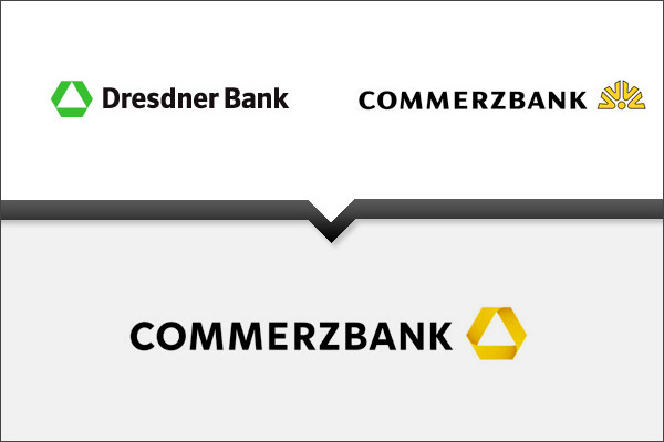
Commerzbank is the second-largest bank in Germany, after Deutsche Bank. The bank is mainly active in commercial banking, retail banking and mortgaging. The company’s headquarters are located in Frankfurt, Germany. Commerzbank was formed by the merger of Dresdner Bank and Commerzbank, keeping the name Commerzbank.
CenturyLink
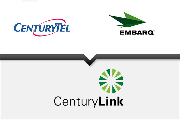
CenturyLink was created by the merger of CenturyTel and Embarq on July 1, 2009. It is the fourth largest local exchange carrier in the United States (below the Baby Bells) and the largest independent local provider, serving customers in 33 states and providing local, long distance, high-speed data and wireless services to residential and business customers.
Alcatel Lucent
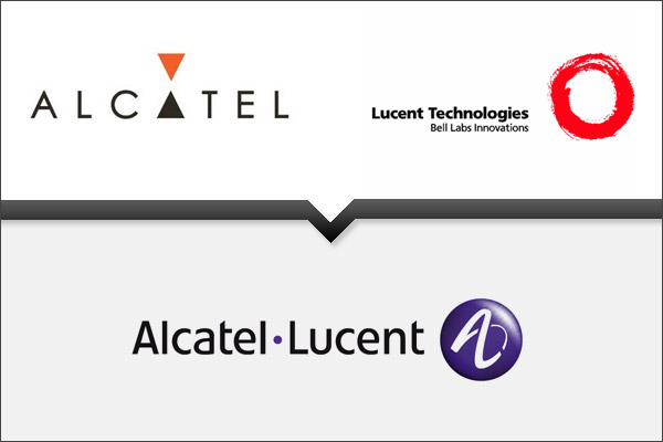
Alcatel-Lucent is a global telecommunications corporation, headquartered in Paris, France. It provides telecommunications solutions to service providers, enterprises and governments around the world, enabling these customers to deliver voice, data and video services. The company has operations in more than 130 countries.
Statoil
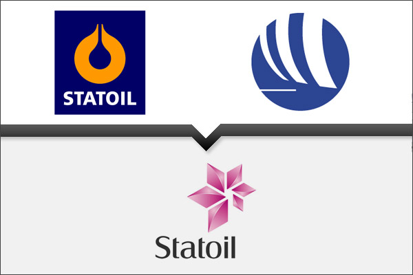
Statoil is a Norwegian energy company, formed by the 2007 merger of Statoil with the oil and gas division of Norsk Hydro. It is the biggest offshore oil and gas company in the world and the largest company by revenue in the Nordic Region. The company is a fully-integrated petroleum company with production operations in thirteen countries and retail operations in eight.
SanofiAventis
Sanofi-Aventis, headquartered in Paris, France, is a multinational pharmaceutical company, the world’s fourth-largest by prescription sales. The company engages in the research and development, manufacturing and marketing of pharmaceutical products for sale principally in the prescription market, but the firm also develops over-the-counter medication. Sanofi-Aventis was formed in 2004 when Sanofi-Synthélabo acquired Aventis.
Lufthansa
Lufthansa is the largest airline in Europe in terms of overall passengers carried. The name of the company is derived from Luft (the German word for “air”), and Hansa (after Hanseatic League, the powerful medieval trading group). The company was founded on January 6, 1926 in Berlin, following a merger between “Deutsche Aero Lloyd” (DAL) and “Junkers Luftverkehr”. The company’s original name was Deutsche Luft Hansa Aktiengesellschaft. Lufthansa, as one word, has been used since 1933.
Aviva
Aviva is a British insurance group, that is also the fifth largest in the world, the largest insurance group in the UK and the second-largest insurance group in Canada operating as Aviva Canada. It is one of the leading providers of life and pension products in Europe and has a presence in 28 countries worldwide, notably France and The Netherlands. The company was created by a merger of Norwich Union and CGU plc.
PriceWaterhouseCoopers
PriceWaterhouseCoopers is one of the world’s largest professional services firms and the largest of the Big Four auditing firms. It was formed in 1998 from a merger between Price Waterhouse and Coopers & Lybrand, both formed in London. PricewaterhouseCoopers is a Big Four auditor, alongside KPMG, Ernst & Young and Deloitte Touche Tohmatsu.

Awesome Post, I never expect how they merge logos after their own merger. lol
Great post, interesting to see how some have merged the logos and others have gone in a new direction. Thanks for sharing.
Interesting post, well done!
Interesting post. Bank of America, Citi, and Statoil pulled it off the best.
very nice post. i didn’t know Anheuser change there logo. now i know because of you.
Huh. This being a design blog I kind of expected some kind of commentary on the designs. I guess my expectations were too high. Interesting logos though.
Great post. You missed AT&T + Cingular.
Nice to see how some companies have merged and hade a change of naming and brand completely. I didn’t know Verizon and Lufthansa were the results of mergers. I kinda wondered what happened to Gulf too, but now I know!
Great post. Very insightful. I had no idea there were other bloggers out there following incessantly logo evolution and every possible other angle about the design vocabulary of logos and corp identity. Thanks!
ciao, dian
Wow, this is a really neat article, very interesting mergers.
I work for ExxonMobil. They recently merge with some _________ company. Just like BP with AM/PM. Shell with Circle K. We are having a meeting on Monday. Let see what happens.
ExxonMobil suck.
BP and Shell got the best gas.
Great stuff…
Brilliant post, it’s great to see good logos coming together to create even better ones.
Wonderful inspiration and information. Thank you.